
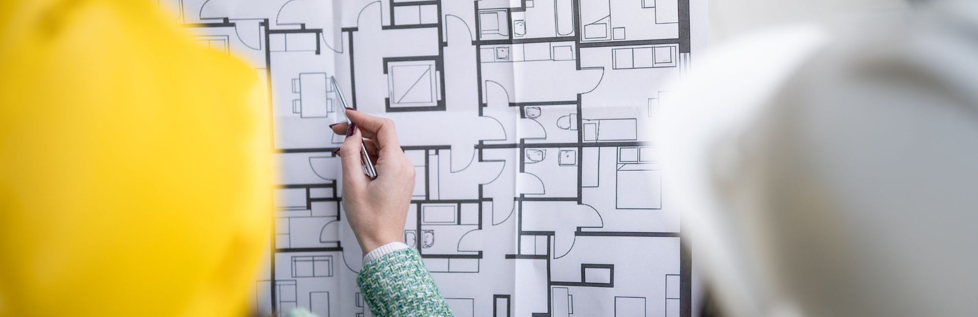
Approving an office layout is one of the most important decisions in any workplace project. Once construction begins, changes become costly, disruptive, and stressful. Yet many business leaders sign off on layouts without fully understanding how the space will function in reality.
An office layout is more than a drawing. It is a working blueprint that shapes how people move, collaborate, focus, and experience the workplace every day. Knowing how to read and question a layout empowers decision makers to approve with confidence rather than uncertainty.
At Tridyum Interiors, we guide clients through this process carefully. Layouts should feel logical, purposeful, and aligned to how teams actually work. This article explains how to read office layouts clearly, identify potential issues early, and use visual tools to make informed decisions.
Why office layouts matter more than you think
Office layouts influence productivity, communication, and wellbeing. They determine how easily teams interact, how noise travels, and how efficiently space is used.
Research published by the Leesman Index shows that over 60 percent of employees feel their workplace does not fully support their work activities. Poor layout planning remains one of the leading causes.
Layouts approved without scrutiny often result in overcrowding, circulation issues, lack of privacy, or underused areas. These problems are rarely design flaws alone. They are usually the result of decisions made without fully understanding how the space will be used.
Reading a layout well is not about technical expertise. It is about understanding function, flow, and intent.
Understanding space planning drawings
Space planning drawings may appear complex at first glance, but they follow clear logic once you know what to look for.
Start with the big picture
Look at how the space is divided. Identify major zones such as work areas, meeting rooms, collaboration spaces, and support areas. Ask whether the balance reflects how your teams operate.
An organisation that relies heavily on teamwork should not prioritise isolated desks over shared spaces. A business that requires focus and confidentiality needs sufficient enclosed areas.
The layout should tell a story about how work happens.
Check circulation and movement
Circulation routes show how people move through the space. Poor circulation leads to disruption, noise, and frustration.
Ask these questions:
• Can people move easily without cutting through focused work areas
• Do main walkways feel direct and intuitive
• Are shared spaces accessible without disturbing others
Good circulation supports flow. Poor circulation creates constant interruption.
Understand scale and proportion
Furniture symbols represent real dimensions. Desks, meeting tables, and seating require clearance for comfort and accessibility.
A layout that looks spacious on paper can feel cramped in reality if clearances are too tight. Ask for confirmation that spacing complies with ergonomic and accessibility standards.
Comfort should never be assumed.
Identifying workflow issues early
Layouts should support workflow rather than force teams to adapt.
Follow the journey of a typical workday
Visualise how employees arrive, move, collaborate, focus, and leave. Trace these journeys across the layout.
Notice where friction may occur. Meeting rooms placed far from teams that use them frequently. Printers located in high traffic areas. Quiet workstations positioned next to noisy zones.
Small misalignments compound daily frustration.
Watch for bottlenecks
Bottlenecks occur where circulation narrows or functions overlap. Common examples include shared resources clustered too tightly or access routes passing through meeting areas.
Identifying bottlenecks early prevents disruption later.
Consider adjacencies carefully
Adjacency refers to which functions sit next to each other. Teams that collaborate often should be positioned nearby. Noisy areas should be buffered from focus zones.
Adjacency planning improves efficiency and reduces unnecessary movement.
Using 3D renders and walkthroughs effectively
Two dimensional drawings have limitations. Three dimensional tools bridge the gap between plan and reality.
Seeing scale and volume
3D renders help clients understand ceiling heights, proportions, and spatial relationships. They reveal how furniture fits within the space and how areas feel in use.
Scale is often the biggest surprise once a space is built. Visual tools reduce that risk.
Experiencing flow and atmosphere
Virtual walkthroughs allow decision makers to move through the space before construction begins. This reveals how areas connect and how transitions feel.
Lighting, materiality, and openness become clearer. Confidence increases when clients can experience rather than imagine.
Supporting better decision making
According to a study by McKinsey, visual decision making tools improve stakeholder alignment and reduce late stage changes by up to 40 percent.
Walkthroughs help teams align early and approve with certainty.
Asking the right questions before approval
The most successful projects involve informed clients who ask the right questions.
Questions about people
- Does this layout support different working styles
- Are there spaces for focus, collaboration, and informal interaction
- Does the environment feel inclusive and accessible
People should sit at the centre of every decision.
Questions about performance
- Does the layout support productivity rather than distraction
- Are teams positioned to work efficiently
- Does the space adapt as needs change
Performance driven layouts reduce friction and support outcomes.
Questions about the future
- Can this space adapt to growth or change
- Are furniture systems flexible
- Will this layout still work in three years
Future readiness protects investment.
Common mistakes to avoid
Rushing approval creates risk. Assuming understanding without asking questions leads to regret.
Other common mistakes include approving layouts without visual tools, ignoring workflow patterns, or prioritising aesthetics over function.
A layout should never be approved simply because it looks good.
The Tridyum approach to layout approval
At Tridyum Interiors, layout approval is a collaborative process. We guide clients through drawings, 3D views, and walkthroughs to ensure clarity.
Design decisions are explained, not assumed. Clients are encouraged to question, challenge, and engage.
This approach reduces rework, improves satisfaction, and delivers spaces that perform as intended.
Frequently asked questions
Do I need technical knowledge to approve a layout
No. A good design partner should explain layouts clearly and guide you through decisions.
When is the best time to request changes
Early in the layout phase. Changes become more costly once design development begins.
Are 3D walkthroughs necessary
They are not mandatory but they significantly improve confidence and reduce risk.
How long should layout approval take
Enough time to understand, question, and align. Rushed approvals often lead to later delays.
Confidence comes from clarity
Reading an office layout well empowers leaders to make informed decisions. Understanding flow, scale, and function prevents costly mistakes and ensures the workplace supports people and performance.
Layouts are not just drawings. They are commitments to how work will happen every day.
At Tridyum Interiors, we believe confident approvals lead to successful spaces.